<rant>
Here’s a screenshot of the iPad calendar, courtesy of GigaOM.
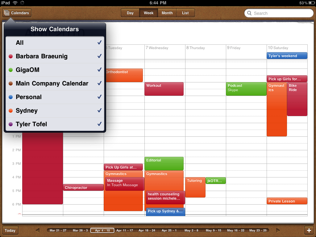
It’s a small nitpicky thing of mine, but Apple’s UI decisions here annoy the heck out of me. Note how they’re using the brown to give off the appearance of an actual calendar, something physical that people can grab and manipulate.
Hogwash I say.
First, it’s half-assed. Apple prides itself on delivering a complete UI experience, but seriously, this UI here? It clashes with the rest of the iPad UI, unless real calendars have black floaty selection boxes hovering over them. Or have buttons and search boxes built into them. It looks like they thought of a more traditional computer UI first, with all the buttons and what not, and then slapped on this layer of velvety brown physicalness. That’s half-assed.
Second, it’s pointless. The velvety brown look isn’t more intuitive. It’s the exact same UI you would use on a computer, except it looks more physical. I guess that invites me to touch it, but really, do I really need a cue to touch the iPad?
Third, it’s ugly. Seriously, Apple has this steel, chrome, elegant look down. iPads are supposed to be shiny. The last thing it needs is brown.
</rant>
Comments